By Nikki Kallio
After several years of having the same color on your walls, you might get the urge to change it up. Or, maybe that hot hue from years ago now feels dated. Giving your walls a refresh with a trending color can help brighten your space and mood, say Madison-area interior designers.
WHAT’S TRENDING
A few up-and-coming color trends mix in well with timeless and classic décor, says Shannon Figaro of Fig Interiors.
One trend is tone-on-tone neutrals, in which the same paint color is used on walls, trim and doors, but with different finish, Figaro says.
“That’s a really beautiful way to incorporate a neutral color. And we’re seeing a lot of warm neutrals, so the trends are definitely going toward warmer colors overall.”
Deb Corning of DC Interiors & Renovations says soft black — which technically can range from a cooler dark gray to a warmer, almost-brown, building on tones of blue or green — has recently emerged as a popular neutral. She also notes that using a soft black tone can be a chic way to update a room with gray walls, which was trendy a few years ago. Complementary colors to soft black hues include sky blue, olive green and peach.
POPS OF PERSONALITY
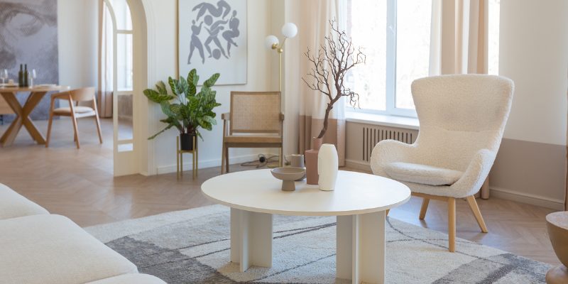
Neutral tones throughout a room allow you to easily pull in accent colors via soft furnishings. Think: accessories, rugs or curtains, Figaro says.
“You can definitely use warm, neutral colors as your base and then really bring in some personality with color [in] the softer elements in the room,” she says.
Blue shades are a good accent choice, Figaro says. Additionally, “we’re seeing a lot of really rich greens, and even corals and pinks. Those would all be beautiful accent colors to incorporate with a warm neutral.”
Corning is seeing clients incorporate blue tones in cabinetry, including navy or darker blues. Sure, choosing color for cabinetry can feel risky, but it also makes a bold statement, and one that you can love for years to come.
“My philosophy is, if you [pick] a color you love, you’ll be able to live with it for a long time,” Corning says.
HOT HUES
Figaro says color trends are shifting away from grays, which have been popular for the past decade or so. Part of the reason could be related to the end of the pandemic: “People are returning back to habits they love, one being travel,” Figaro says. “People really like to incorporate colors from places they’ve visited or places that are meaningful to them.”
An example might be incorporating the Santorini blue of the Greek islands, or the terracotta tones of the Arizona desert, into pillows or other accessories. The return to travel is “creating a resurgence of really bold colors, which is really fun,” Figaro says.
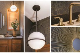
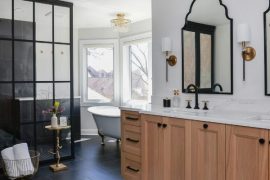
POPULAR PAINT CHOICES
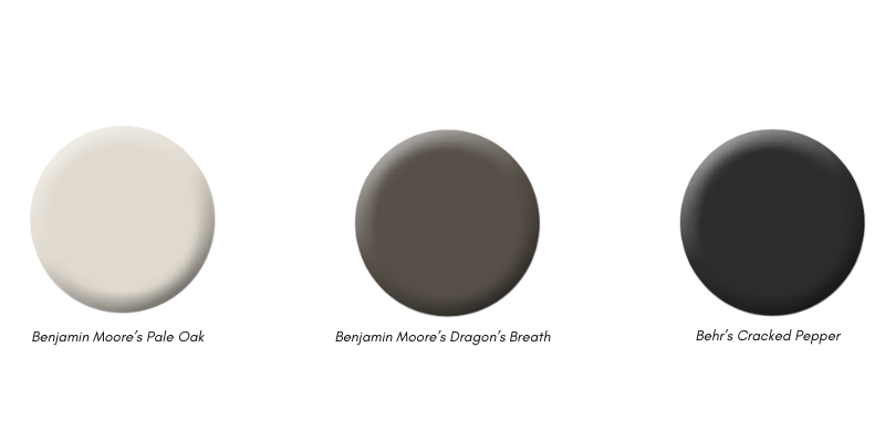
Benjamin Moore’s Pale Oak: This color has warm gray undertones and is “an example of a tone-on-tone neutral that I would love to see in a room,” says designer Shannon Figaro of Fig Interiors. It pairs well with pops of color like the company’s Blue Nova, its 2024 color of the year, or Sherwin- Williams’ choice Upward, a breezier, lighter blue.
Benjamin Moore’s Dragon’s Breath: This is a soft black with a deep brown tone that Deb Corning of DC Interiors & Renovations has in her showroom. “It really warms up our walls,” Corning says. “It’s very nice for hanging pictures, because it’s a really dark background.”
Behr’s Cracked Pepper: The company’s color of the year is a versatile soft black that pairs well with their Laguna Blue, Mountain Olive and Offshore Mist.