By Deanna Kane | Photography by Shanna Wolf
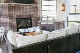
Now, more than ever, seeking solace at home is vital for health and wellbeing. Creating an atmosphere of wellness and grounding can be accomplished through carefully selected home design elements and the power of color psychology.
Every year, the major paint retailers select their colors of the year (see below). For 2020, they made prophetic color selections — each hue was chosen to inspire relaxation and reprieve at home, which is beneficial as we continue to be impacted by COVID-19. To create your own at-home sanctuary, local interior designers shared their insights into integrating a wellness- focused approach when designing a home — including using color to create a much- needed tranquil atmosphere.
THE POWER OF SIMPLICITY
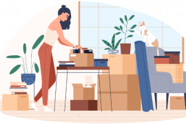
As people continue to seek refuge at home, many spaces are multi-purpose. Simplicity is a must to prevent a chaotic energy.
“As we use existing spaces for new purposes, like homeschooling and work, there is a trend to keep spaces simple, but also inviting,” says Erica Zander Meier, owner of Zander’s Interiors.
A relaxing atmosphere requires editing to remove negative emotions that are often the result of too many items.
“When I create spaces meant for relaxation, I remove visual clutter,” says Carrie Simpson, owner of Vault Interiors & Design. “Eliminating excess can reduce stress or anxiety.”
“This pandemic has taught us to place more value on things we love. There is no way to
feel relaxed in a space that is overflowing with piles, boxes, bags and toys,” says Sarah Helf, founder and lead designer at Sarah Helf Interior Design, LLC.
LOOKING INWARD
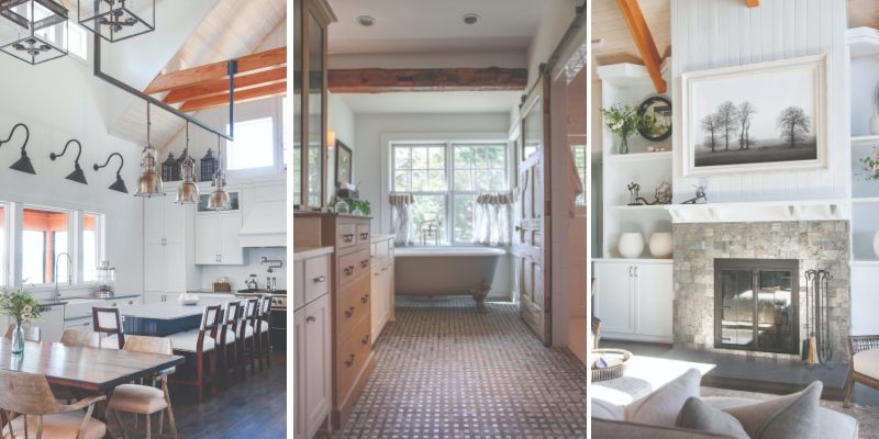
Recognizing the elements that calm you is an important part of a wellness-focused home design.
“Identify what makes you relaxed and happy,” says Helf. “For example, if natural elements soothe you, incorporate wood furniture, plants and different textures.”
While personal preferences are what make your home unique to you, relaxing spaces often have the same unifying features.
“Combining design elements such as soothing color palettes, lighting, correct spacing of furniture and mindful decor will facilitate relaxation at home,” says Nicole McCoy, owner of NicoleMdecor.
Lighting plays a substantial role in the feeling of a space. Helf says, “A correctly lit room can elevate your mood.”
Questions Helf asks her clients include, “Are you able to bring more light into your home by enlarging window openings or fully opening window coverings? Are your lights on a dimmer to customize the light by task and time of day?”
COLOR PSYCHOLOGY
Color is a low-effort, high-impact way to update the space, and change how the room makes you feel.
“I have seen an increase in blue and green color palettes. Blue can calm your mind and reduce anxiety. Green can also be restorative,” says McCoy. “My clients are subconsciously choosing these colors because they need a calming space.”
Achieving relaxation at home through the use of color is unique to each individual.
“Changing a paint color in a room can create a new mood,” says Meier. “I did this in the first two weeks of the safer at home order. We selected a dark navy blue to create a more restful and cozy space for reading and relaxation.”
Color palettes in neutrals, blues and greens are top choices to create repose in a room.
NEUTRALS
- Creamy white. “When I create tranquility in a space I always include paint colors with warm undertones, like Sherwin-Williams Creamy,” says McCoy.
- Greige. “Many of my clients like warm tones, like Benjamin Moore Gray Owl or Balboa Mist,” says Helf.
- White. “A fresh, light space can quiet the mind. “A few of my favorite white paint colors are Sherwin-Williams Alabaster; Benjamin Moore White Dove, a warm white; or Benjamin Moore Chantilly Lace, a crisp, bright white,” says Simpson.
BLUES AND GREENS
- Spa blues and greens. “We typically see colors that reflect the ocean, including Benjamin Moore’s Beach Glass and Sagebrush,” says Meier.
- Greens. “Greens can be calming and grounding. A soft, blue-green like Sherwin Williams Sea Salt is great for creating a spa-like room, and Benjamin Moore Vintage Vogue for rich, deep color,” says Simpson.
- Navy blue. “Blue is perfect if you are looking to promote more stillness in your home. Sherwin- Williams Languid Blue is peaceful and restful. Benjamin Moore Hale Navy is great in a bedroom or den,” says Simpson.
“Finding the right color for a room can dramatically change how you feel in that room: relaxed or energized, restored or agitated, even how productive or distracted you are,” says Simpson.
2020 COLORS OF THE YEAR
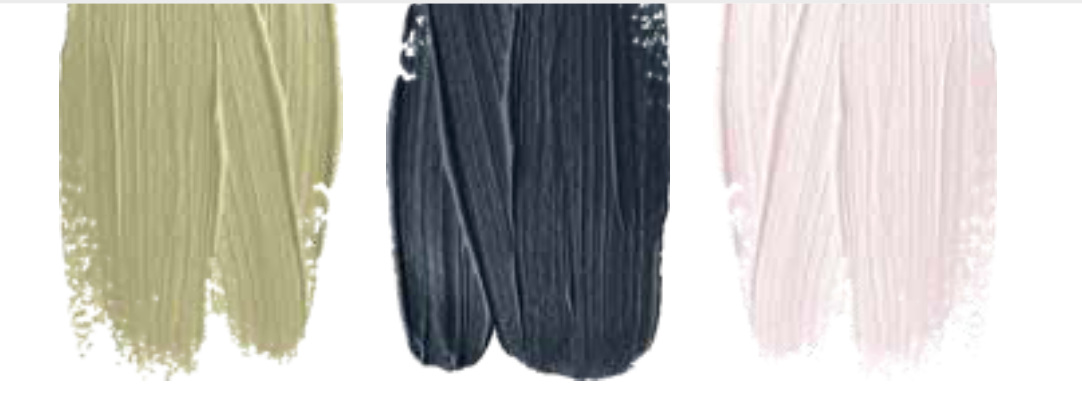
- Behr, Back to Nature: The “restorative, meadow-inspired shade of green” creates a purified, balanced space by bridging the indoors and outdoors.
- Sherwin-Williams, Naval: The rich navy hue introduces restfulness and tranquility into the home. This versatile neutral can create a grounded and calm space.
- Benjamin Moore, First Light: The soft, rosy hue reflects a shift in mindset from the material to satisfying the core needs in life: community; comfort; security, self-expression; authenticity and ultimately; optimism.”