
By Hannah Wente
Paint swatches, siding samples and roofing materials line the back of Laurie Lundgren’s charcoal Toyota Prius—which she calls her mobile design studio. She works wherever the job is. Lundgren opened her residential and commercial painting business in 1995 at age 26. Five years ago, she retired her paintbrushes and hung up her ladder, but her color consulting business, Laurie Lundgren Color & Design, remains in full swing. In 2019, she completed 450 design consultations. Amy Stacey worked with Lundgren in 2018 to select a color palette for her eastside bungalow. She wanted to maintain the historic look of the home and neighborhood.
“I told Laurie I wanted something whimsical, maybe blue,” she says. “She pulled a color combination out of the back of her car with a beautiful blue and a green accent color. We ended up going with that first choice. She’s like a magician.”
People knocked on Stacey’s door to remark on the bungalow’s transformation.
“It’s a corner house,” says Stacey, “So it really woke up the neighborhood.”
According to Stacey, three neighbors were so inspired they repainted their homes using Lundgren’s advice.
Each color consultation starts with a home visit so Lundgren can get a sense of the neighborhood and home. She tries to infuse the client’s personality and home’s architecture into the space through color choice. Her clients use adjectives for their desired look, like classy, playful or conservative. She translates those adjectives into color.
“Think of me as an interpreter,” she says. “[Clients] don’t have to know what color they want; they just need to tell me how they want the house or space to feel.”
Lundgren could visualize color combinations as a child. This led her to a degree in graphic arts and printing from UW-Platteville. She turned down a job at an advertising agency because it felt too corporate and limiting. Thankfully for Madison residents, she uncovered her true calling.
“I love every single part of what I do,” Lundgren says. “My favorite part is making people fall in love with the house they already own and making them love it even more than when they met me.”
Three Expert Color Combinations
People often make the mistake of putting things in the same color value, but contrast is what makes for good design. Each of these combinations have a light, a dark and a mid-range color value.
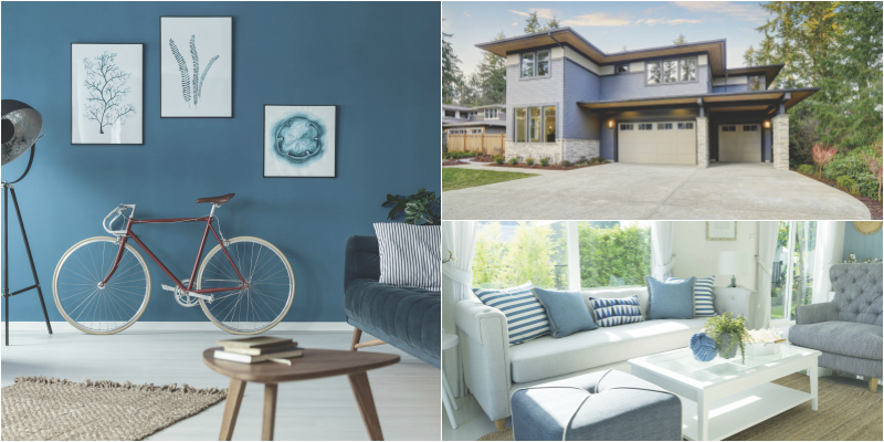
- COASTAL: Navy blue with winter white and soft camel.
- SUNSET: Charcoal, with burnt orange and cream.
- NATURE: Light putty paired with a dark mushroom, then accented with a muted blue-green.
Pro Tips
- Lundgren says it’s a myth that small spaces like powder rooms should have neutral colors. Powder rooms don’t have a lot of constraints, meaning you can add bright, bold colors and really make an impact.
- In fall and winter, a lack of light means color selection should only occur before 1:30 p.m. When the sun is low in the sky, it distorts colors and casts long shadows.
- The new “it” color? Khaki.
A Step-By-Step Color Guide:
- Look for constraints. Is the roof/countertop/floor/furniture staying the same? If yes, work around it.
- Think of a walk through your house as similar to a drive. On the interstate you want to be safe, so leave foyers/hallways/stairwells simple and plain by painting them light and neutral colors.
- Living rooms and kitchens should be like a drive through town: use mid-tone neutrals.
- Add eye-catching color to hidden areas of the house, such as bold and deeper accents.


Comments are closed.